@supports rule on CSS

Furkan is a software engineer and frontend developer, whose main purpose is to create best optimal experience for user but also keeping the application or project as performant as possible.
He is deeply interested on web technologies and he is building new projects in this subject. He is especially familiar with React, Vue, Node and Java. You can check out what he built on his GitHub account. There is potential ways to connect with him at the end of this summary 👇
Things he like to do; ✔ Trying to solve other people's struggles ✔ Teaching or telling some subject he know to friends or colleagues ✔ Building different kinds of projects ✔ Meeting & talking with new people ✔ Listening podcasts ✔ Playing Chess ✔ Watching drama | sci-fi movies ✔ Listening music while I travelling or trying to fix problems ✔ Researching next generation technologies like cyptocurrency, IoT, smart devices
If you want to reach out with him, here is how you can do it;
🔼 Blog: https://blog.furkanozbek.com/ 🔼 GitHub: https://github.com/afozbek 🔼 Mail: abdullah.furkan.ozbek@gmail.com 🔼 Twitter: https://twitter.com/afozbek_ 🔼 Instagram: https://instagram.com/furkan.codes/
Thanks for reading ✨
Table of Contents
1. Definition
@supports property allows us to test if the browser supports particular property before applying the styles. It can be same as @media property which applies the styles in particular breakpoint.
The syntax looks like this;
@supports (display: grid) {
  #root {
    display: grid;
  }
}
2. Browser Support
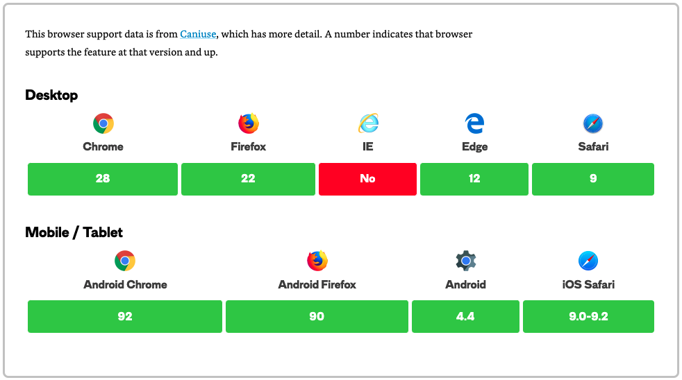
If @supports is supported all the browsers you need then it is time to use it in your applications as well. It gives really nice features that you can control.
Here is the browser support for it;

3. Javascript Usecases
In JavaScript, @supports can be accessed via the CSS object model interface CSSSupportsRule
The CSS includes a CSS feature query using the @supports at-rule, containing one style rule. This will be the first CSSRule returned by document.styleSheets[0].cssRules.myRules[0] therefore returns a CSSSupportsRule object.
let myRules = document.styleSheets[0].cssRules;
console.log(myRules[0]); // a CSSSupportsRule representing the feature query.
Javascript even has an API for this. We can test some properties here as well;
if (window.CSS && window.CSS.supports) {
 // See if API supported in this browser
}
// You can seperate the property and the value.
const supportsGrid = CSS.supports("display", "grid");
// Or you can give all in one
const supportsGrid = CSS.supports("(display: grid)");
4. Logic Operators
4.1. Not operator
It will apply the rules if the specified rule is not true
@supports not (display: grid) {
    #root {
        display: flex;
    }
}
4.2. And operator
It will apply the rules once both of the cases apply true
@supports (display: grid) and (display: flex) {}
4.3. Or operator
It will apply the rules if at least one of them is true
@supports (transform-style: preserve) or (-moz-transform-style: preserve) {}
5. Selector Testing (Experimental)
There is a way to test the support of selectors with @supports in some browsers (Firefox, etc.)
@supports selector(A > B) {
    .container {

    }
}


